
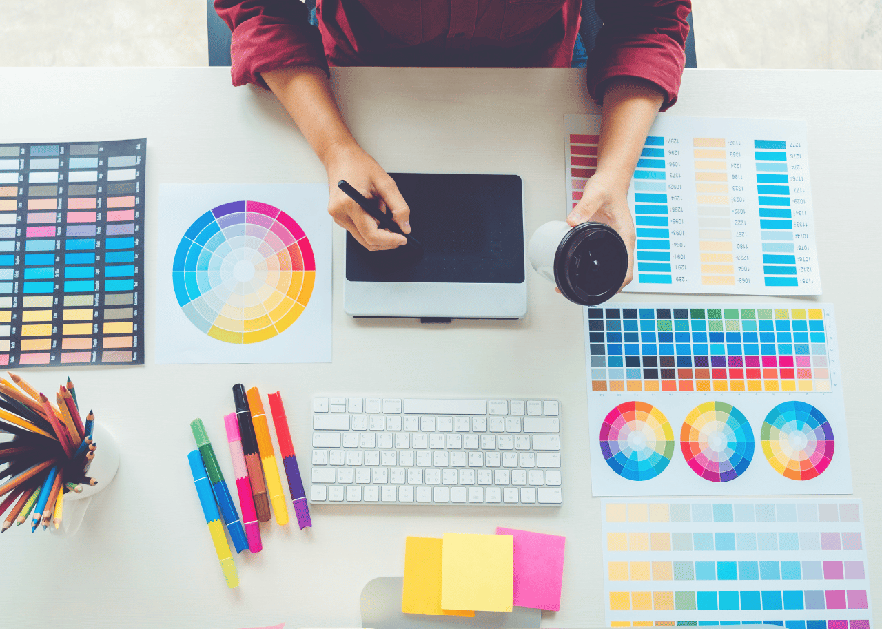
Why Colors Are Important for Graphic Designer??

Color is a universal language and a Powerful Communication tool. Of all the elements that make up a visual design, color is perhaps the most vital and influential. Research conducted by psychologists and marketers have highlighted how color can influence our emotions and perceptions. Color schemes are often used to place emphasis on particular aspects of a design or to evoke a desired mood or emotion in the viewer. Designers use color selectively to create harmony, balance, and consistency.
• Color, Psychology and Emotion
Color psychology is the study of how colors affect behaviour and perceptions. It’s important to be aware that color associations are often influenced by personal experience and cultural factors and it is too simplistic to assume that color associations are universal. Nevertheless, research has found consistent associations. ‘Warm Colors’ like Red, Orange and Yellow excite and arouse, while ‘Cool Colors’ like Blue and Green have a relaxing and calming effect.
• Let’s see the Importance of colors.
1) Red

Red is one of the most highly visible colors on the spectrum. It is Warm Color, Strongly associated with excitement, action, danger and passion. Red increases heart rate and blood pressure and creates a sense of urgency. It is widely used on warning signs and stop signs as it quickly captures attention and prompts action. In marketing, brands like Red Bull and Ferrari use Red in a similar way, to attract attention, and to convey a sense of energy and excitement.
2) Blue

Blue is a Cool Color and has a more calming and relaxing effect. It is strongly associated with maturity, integrity, and trustworthiness. It is no coincidence that so many large organisation choose blue in their branding. IBM, Facebook, Twitter, Samsung, Intel, Ford, RBS. Blue is soothing and reassuring. It creates a sense of Security and Conveys Honesty, Professionalism, and Reliability.
3) Orange

Orange is a Warm, Confident and Cheerful Color. It sits between red and yellow on the color spectrum and combines the excitement of red with the brightness and cheerfulness of yellow. Fun, friendly and uplifting, orange is a popular color in sports, and is often used by brands targeted at young people. Fanta soft drink, Nickelodeon Television and Mozilla use orange in their branding to share their sense of enthusiasm and energy with their audience.
4) Yellow

Yellow is also a Warm Color and is associated with optimism and youthfulness. Fun, smiley faces and sunshine. Yellow is often used on children’s toys and to advertise children’s products. Its brightness sparks enthusiasm and is widely used in promoting special offers to catch customers eyes. It is also associated with mental clarity and logical thinking. Bright, energetic, and eye-catching, yellow is more effective when used sparingly, or with a darker tone for balance.
5) Black

In color Psychology, black’s color meaning is symbolic of mystery, power, elegance, and sophistication. In contrast, the color meaning can also evoke emotions such as sadness and anger. Many fashion retailers have used black in their logos. Black is also a popular color for text as it’s an easy color to read.
6) White

Some of the positive meanings that white can convey include cleanliness, freshness, and simplicity. The color white often seems like a blank slate, symbolizing a new beginning or a fresh start. On the negative side, white can seem stark, cold, and isolated.
Color Pychology Video link is share below
However, the lightness or darkness (value), saturation, and hue of colors can change how they are perceived. It is crystal clear that color is not just for aesthetic value, but delivers an intrinsic value to its viewers.
If you have any similar questions, please contact Versatile Educaare System and Join the Ankuram Group for similar new topics.
In addition, to get answers to any of these Questions, Immediately join “Ankuram – Your Child’s Self – Discovery” – ANKURAM
Facebook Page – Versatile Educaare System
Facebook Group – PRAGYAKULAM
YouTube – Versatile Educaare System
Thank You
Graphic Designer – Vishal Ziman
For More Details – Contact


Comments